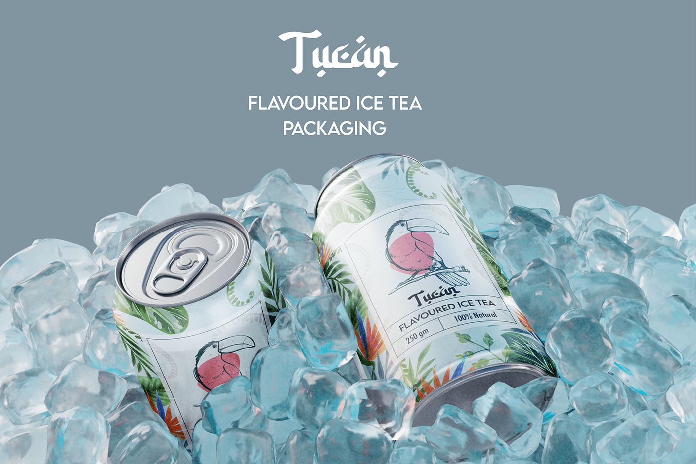
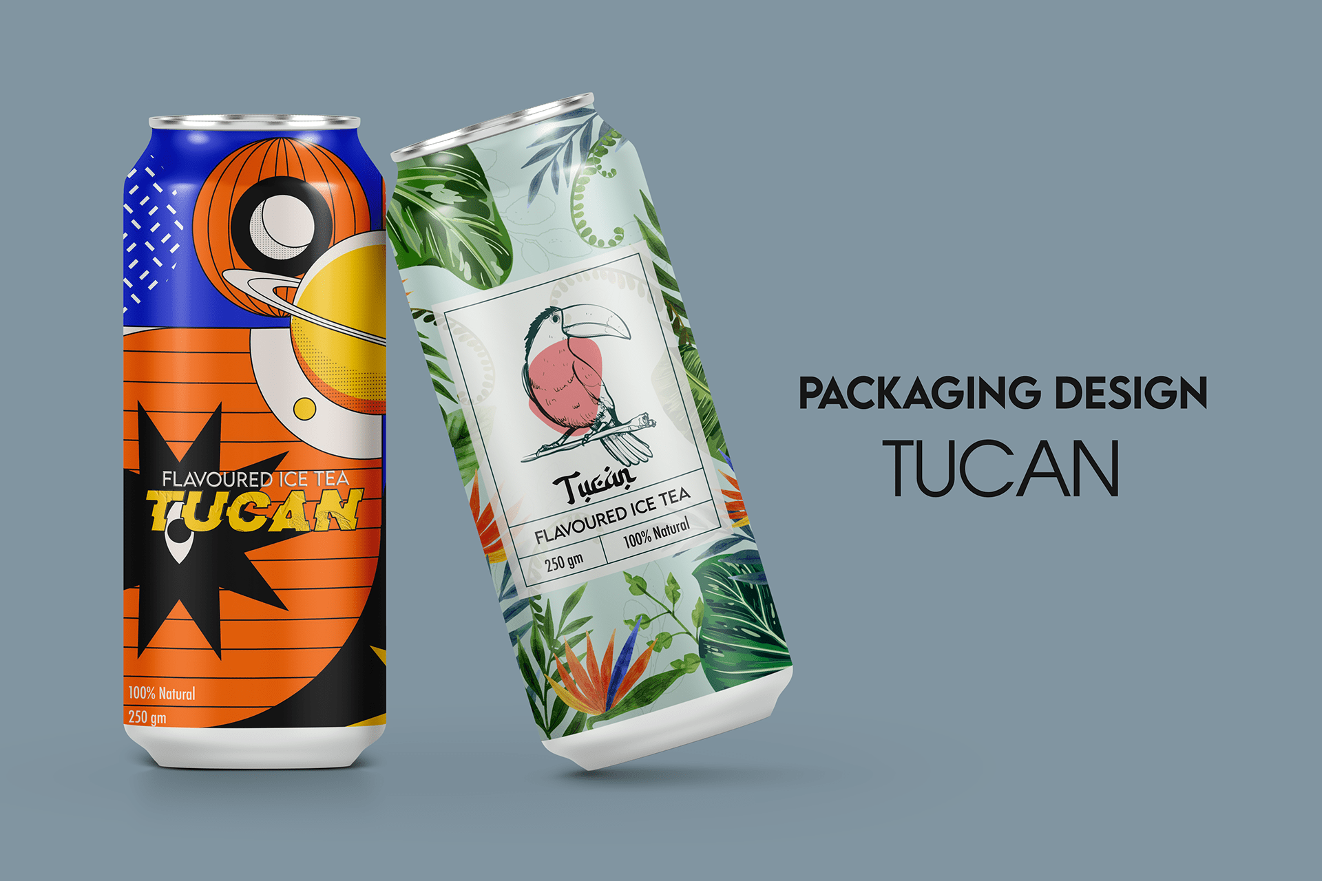
At Koyel Design, we had the pleasure of working with Tucan Ice Tea to create a refreshing and vibrant packaging design that stands out on the shelves and resonates with the brand's lively spirit. Our goal was to capture the essence of Tucan Ice Tea—an invigorating and delicious beverage—through innovative and appealing design elements.
Design Concept
The design concept for Tucan Ice Tea revolves around the theme of tropical refreshment. We aimed to convey the cool, invigorating experience of sipping on a perfectly brewed ice tea, enhanced by the exotic and colorful imagery inspired by tropical environments. The use of bright colors, playful fonts, and engaging graphics brings the packaging to life, making it as enjoyable to look at as the drink is to consume.
Key Features
Vibrant Color Palette: We chose a mix of bright, tropical colors that not only attract attention but also evoke a sense of freshness and vitality. The colors reflect the various flavors of Tucan Ice Tea, making it easy for consumers to identify their favorite variant at a glance.
Engaging Graphics: The packaging features dynamic and lively illustrations of toucans and tropical flora, reinforcing the brand’s identity and creating a fun, inviting look.
Clear Branding: The brand’s logo is prominently displayed, ensuring that it is easily recognizable. The design also includes essential product information in a clear and concise manner, making it user-friendly.
Functional Design: Beyond aesthetics, the packaging is designed to be practical and functional, with user-friendly features such as easy-to-open caps and sturdy materials that keep the product fresh.